There's a host of companies betting the farm on chat as a new modality of software. These companies serve two user populations:
- end-users, who talk with LLMs
- developers, who integrate with and wrap LLMs
A challenge AI companies face is that chat, as a medium, lacks an easy way to convey to these populations what they should or can do.
There's a sandbox of competency around any one chat platform, but its an invisible one.
Graphical interfaces implicitly show their sandbox. When I sit down to use Canva, I'm not tempted to try to draft an email. That's because Canva is very clearly not an email client. There's no address book; there's no text editor; there's no button that says "Send".
Chat products, on the other hand, struggle to communicate their boundaries. ChatGPT is pretty good at making posters. Claude Desktop can write and send email. Cursor can write and deploy a web web app. But all of them look to me like a chat window.
As a user, how am I to look at that chat window and know what's possible? As a platform, how am I to nudge users down a path that won't dissapoint?
Subtle cues in chat UI seem to be emerging to address this challenge. They don't prevent the user from asking LLMs arbitrary questions, but they guide them down a path for which the system was designed.
Here are the ones I've noticed so far.
1. Anchor the chat to a visual UI element
Anchoring a chat to a UI element frames it as being about that element.
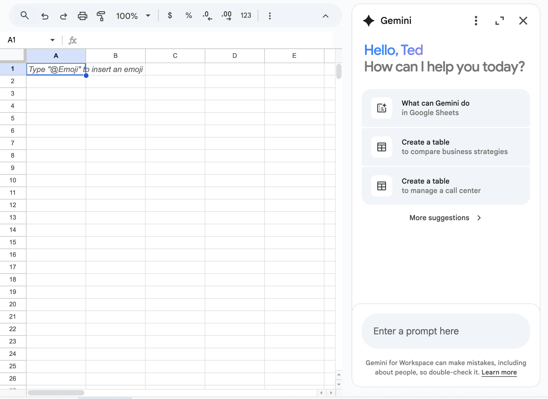
In Google Sheets, a specialized Gemini appears beside the spreadsheet and clearly announces that its purpose is to talk about the sheet to its left. It can answer general chit-chat questions, but when it does, it follows up with spreadsheet-based suggestions.
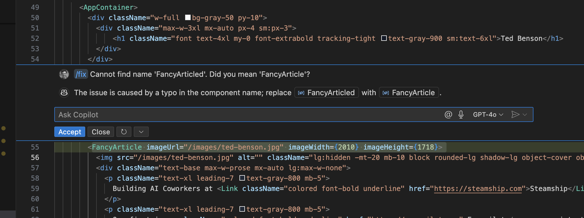
GitHub Copilot has an even stronger anchoring. It squeezes chat windows into tooltip sized modals that hover over problematic code. It's very clear to the chat user that the intent of that chat is to talk about the code highlighted.
2. Start the Chat with a Question
Starting the chat with a question subtly steers the user toward the intended path. Users can ignore the question, but at the cost of a social contract violation: ignoring something directly asked of them.
Products like v0 place the question as a title element, outside the chat.

Other products, especially those integrated with messaging systems like Telegram or WhatsApp, have the AI initiate conversation rather than waiting for the user to say something.
3. Force the user to select an intent
Some systems require user to initiate a chat with an intent chosen from a limited set of options.
CharacterAI is a great example of this. Under the hood, CharacterAI is not so dissimilar to ChatGPT or Gemini or Grok. But from a UX perspective, there's an enormous difference: every CharacterAI chat requires that the user first select a chracter or role-playing scenario.

A user could select "Interview Coach" and then request a recipe for cookies, but any subpar recipes they receive won't cause surprise and confusion. They've clearly requested an Interview Coach, not a chef, and so there's no basis for a user expectation that cookie recipes are within bounds.
4. Encourage Structured Input
Chat systems that can perform complex tasks for a user, like booking a flight, need to clearly communicate which tasks they can and can't do. Unlike a visual UI, there isn't any clear indicator what's possible. This was the problem that plauged smart speakers from the start.
For these systems, using inputs that live-bind user input to known nouns and verbs can provide realtime feedback that system understands what the user is asking of it.
Zapier's agent building interface is an example. As the user types, a dropdown box replaces the text "send email" with the known verb send email -- adorned with extra UI flare to let the user confirm, or customize, its interpretation.
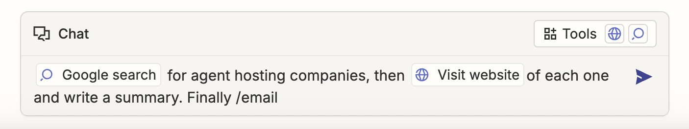
Notion doesn't yet have an agent authoring interface, but their text editor is another great example of this. Using hotkeys like @ or /, a user can signal that they intend to reference a known object rather than mere text.

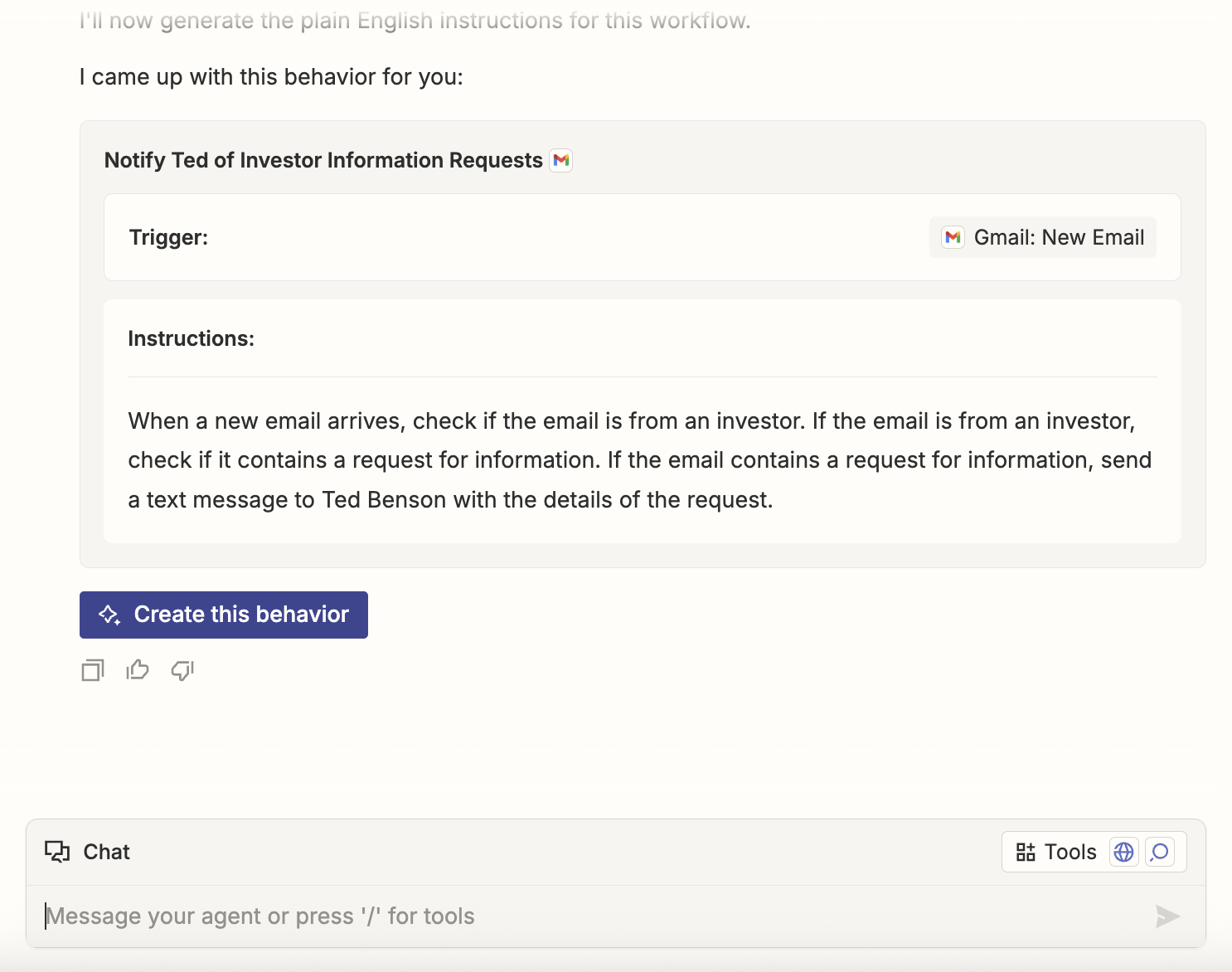
5. Offer graphical widgets
When the chat system knows exactly what it wants, it can leverage UI widgets instead of text chat. This gives the user a better understanding of what's being asked and gives the chatbot an error-free interpretation of the response.
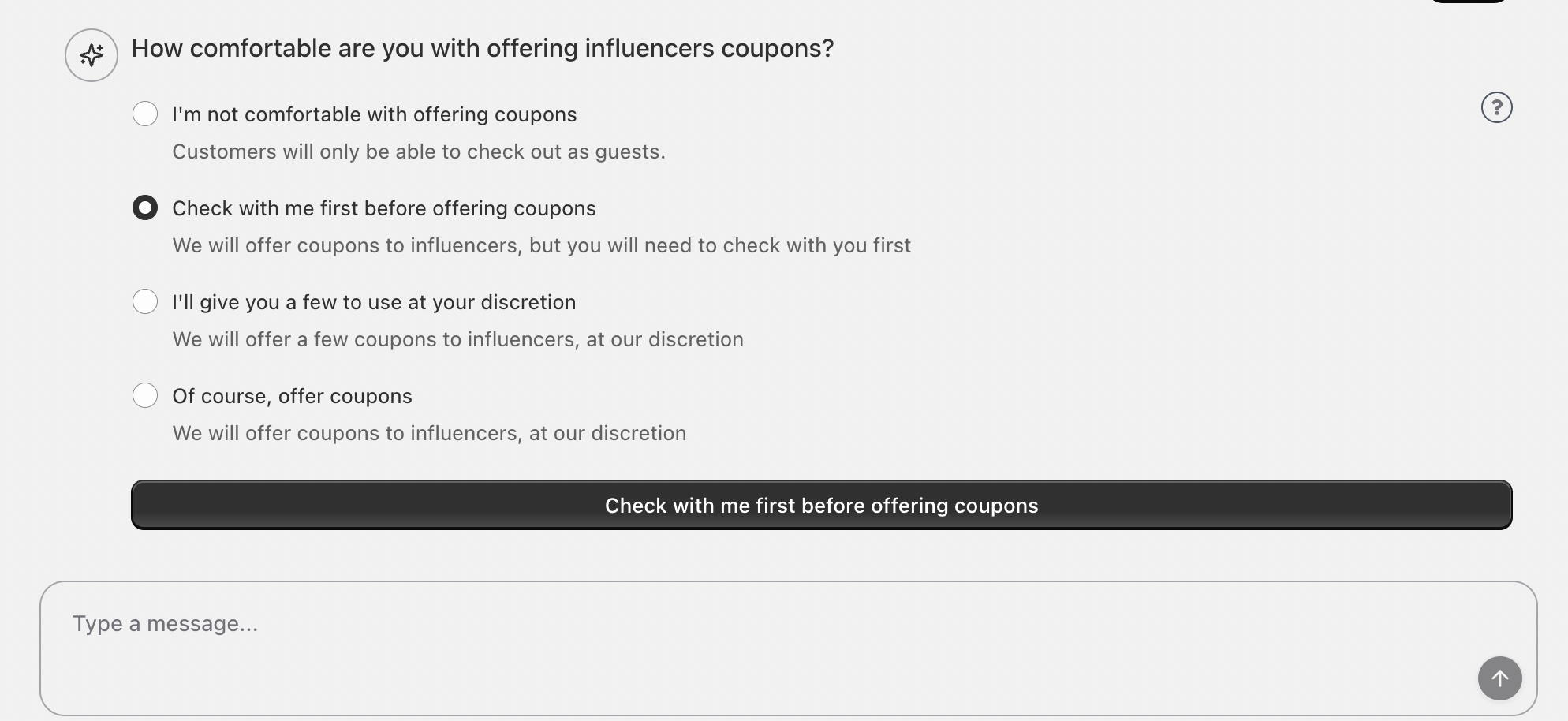
In Everpilot's Shopify integration, a chatbot onboards merchants to an influencer marketing service. When onboarding LLM asks a question that it knows has a structured answer, it selects a UI widget to display to encourage the user to pick an answer that will work well. The user can still respond with open-ended text, but they're nudged to use the easier success path.
Zapier's Agent Builder with a concierge bot that helps the user create a draft of their agent. When it's done sketching a prototype, it offers the user a button to proceed to the next step.
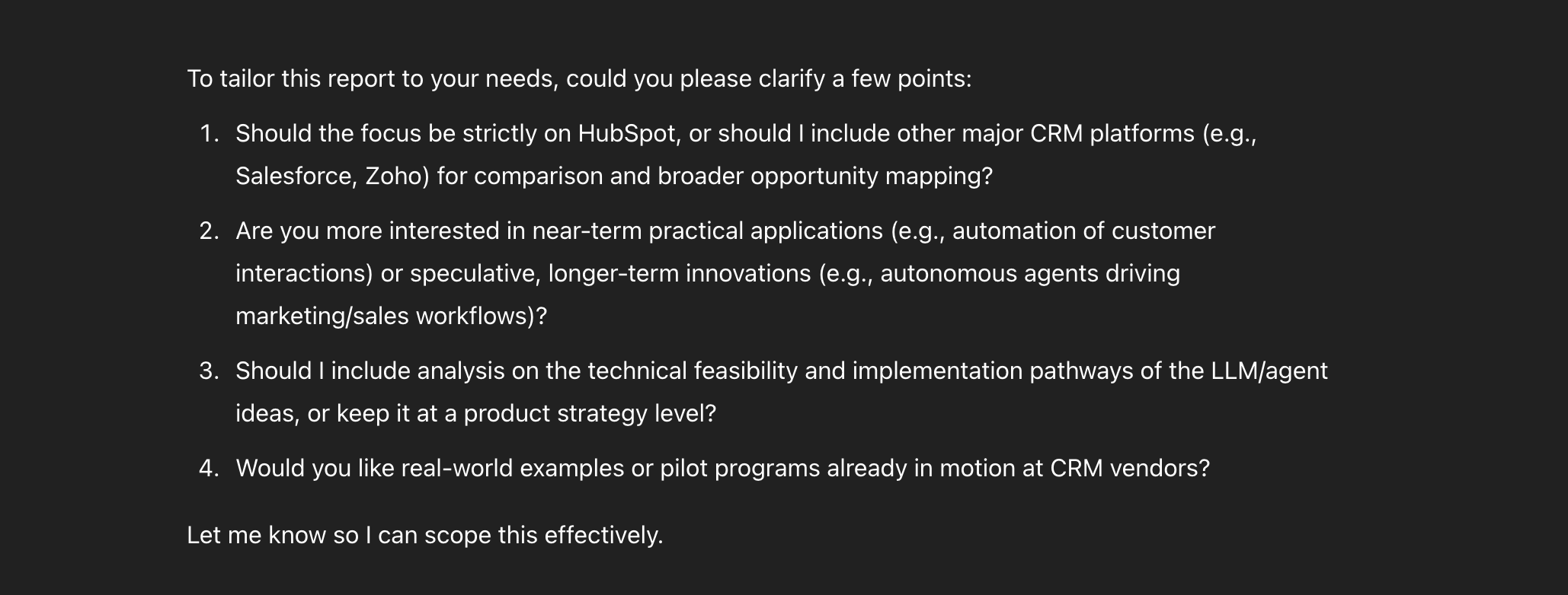
6. Clarify, iterate, or reject, the user's request
When you ask OpenAI's Deep Research for a report on something, it appears to almost deterministically generate a set of follow-up questions to aid in the completion of the report.
It's about to embark on a 30, 50 --- maybe 100 step quest to collect sources and generate a summary. So these follow-up questions are a way to prevent mis-understandings about steps 1-3 to cause enormous deviation by the time the system hits step 100. Much like a few degrees error in a rocket's trajectory can cause it to miss the moon by an extraordinary amount.
But it also is way to validate to the user it understood. Asking good questions requires a good understanding of the world. If DeepResearch asks bad question, as the user I know it didn't understand my request.
Being proactive about rejection is important too. We've all heard a smart speaker say some version of: "I'm sorry, I didn't quite get that." Waving the white flag early is a far better outcome that proceeding to disasterous result. At least then, the user can try a different approach right away.

Conclusion
The allure of chat interfaces is that they're flexible. But that means their boundaries of competence are unclear to users. And that risks user confusion and bad experiences.
You can't solve this problem by erecting rigid boundaries around a chat. To remove the LLM's power to provide Cubano sandwich recipes is to remove its power to navigate a conversation flexibly.
But you can, and should, build cues throughout the chat experience which steer users into the sandbox in which they were intended to play.